![]()
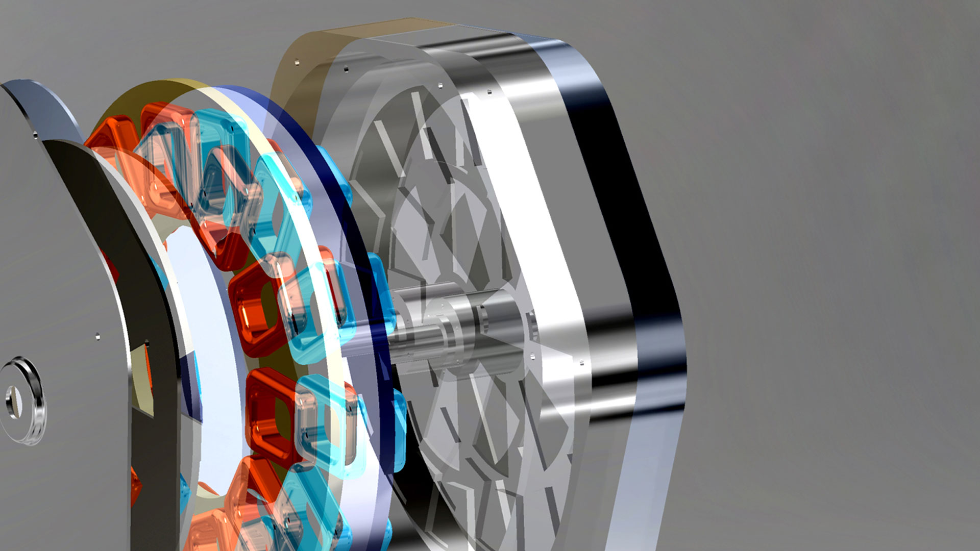
Highlands Power is a Silicon Valley-based company building a revolutionary electric motor for the global electric vehicle market. The founder is a big supporter of Brandlogik’s total brand experience approach and worked with us to drive the brand and business forward and create a revolution in the automotive market.
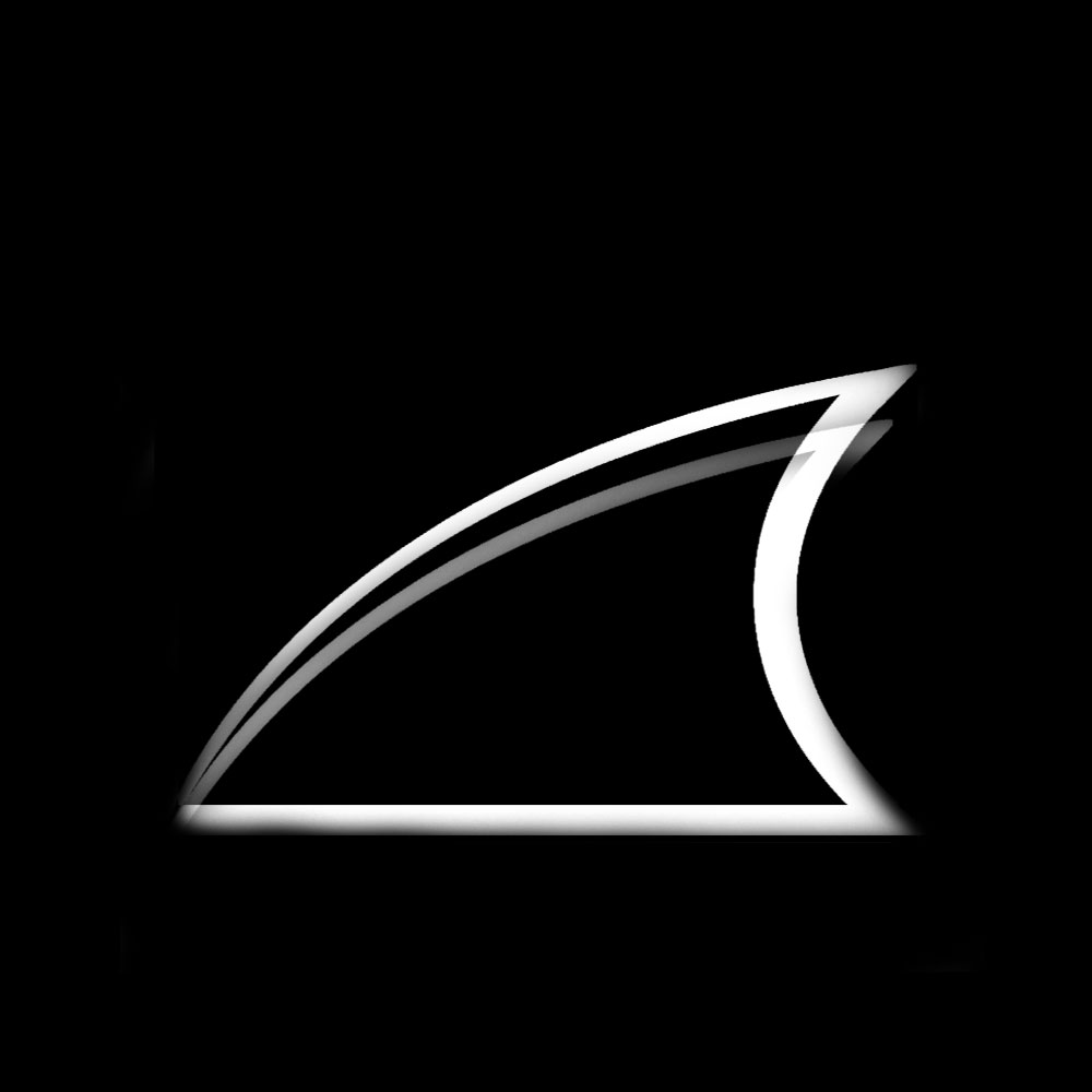
The Highlands Power brand identity is sleek, streamlined and iconic. In reference to the origins of the Highlands name and its part in the founder’s story, we’ve based the brand logo on a simplified but stylish representation of a shark’s fin.
While it was important in the Highlands Power brand story to have this shark reference, the logo also more broadly represented streamlined design and the iconic tail fins found in, especially American, car designs.
The new brand identity is distinctive and stands out on the web and on printed materials. But it works equally well milled from a single piece of aluminium.
The brand logo is iconic. It’s also inclusive as everyone in any culture can take at least one level of meaning from its design. This is important as it’s designed to become a symbol of quality and value in engineering and technology.


